In the modern era of video games, package design and box art is likely an afterthought for many gamers if they think about it at all. Titles such as Elden Ring and Horizon Forbidden West may have made a splash this year, but their key art, while lovely, is by-the-numbers. Like movie poster art, video game box art has largely fallen into a pattern of optimized tropes.
Longtime gamers remember the early days of home gaming before box art had been "figured out" and codified. Hand-drawn box art for games was often experimental and at times amateurish. It could range from gorgeous to terrible, and in many cases barely related to the game inside. But even the ugly ones are fascinating to look at, and it's fun to imagine how the designers ever decided on the art. Recently, gamers on Reddit reminisced about their favorite bad box art from vintage games.
Kabuki: Quantum Fighter (NES, 1990)
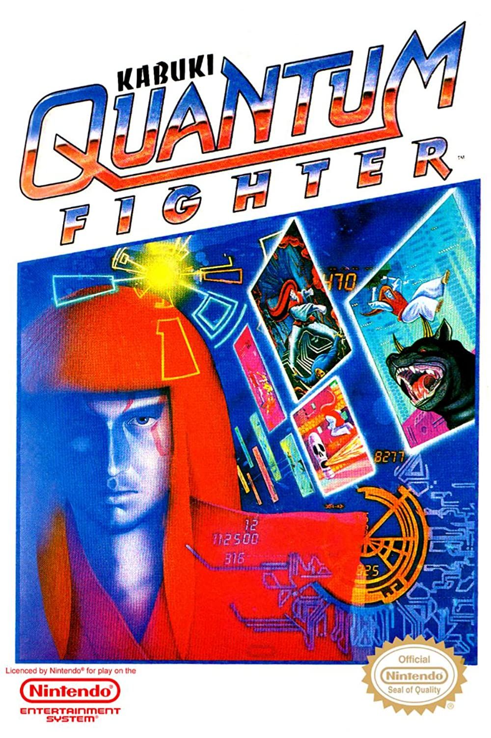
Reddit user bicuspid_fish posts about the worst box art they've seen, saying that Kabuki Quantum Fighter even gave the notorious box art for Mega Man "a run for its money." This is a 2D platformer by Human Entertainment and HAL Laboratory where players control a kabuki actor/fighter who traverses the inside of a computer and fights with their hair.
It's already a wild concept for a game, but the cover art takes it to another level of zaniness. The man on the cover looks nothing like the one players control save for the hair color and the trippy, Tron-like graphics of enemies and mazes try to express what being in a computer would be like but ends up just looking cluttered.
Zelda's Adventure (Phillips CD-i, 1996)
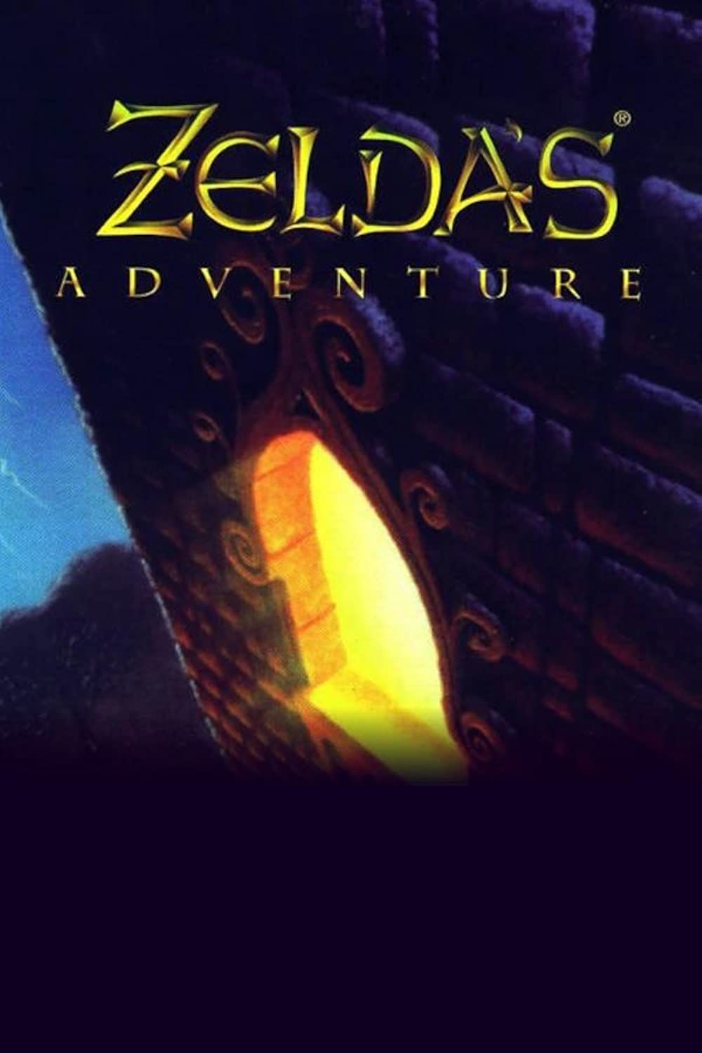
Sometimes box art can be terrible because of how little it tells the purchaser about the game inside. Reddit user inverse-skies writes, "Zelda’s Adventure has got to be up there. It’s literally a picture of a castle window and nothing else." Zelda's Adventure is an obscure entry in the franchise that came out for the Phillips CD-i.
The cover art of the game is of a castle window and nothing else. This is coming from a gaming series with dozens of recognizable and iconic characters and some of the best cover art designs in gaming. To have such a bland cover for this game is inexcusable.
Pro Wrestling (Master System, 1986)
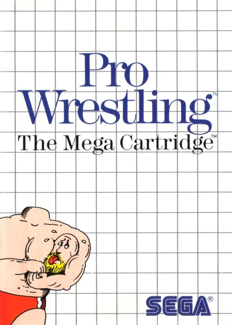
Redditor Woogity names "Pro Wrestling on Sega Master System." This is a wrestling video game that was fairly standard for the time with graphics matching those of similar games that came out at the time. So why the box art looks like the game is an instructional video for Microsoft Office products is a mystery.
It's a completely baffling design for box art. There are few eye-catching colors, it's essentially black-and-white except for the clothes on the wrestler. The background is a boring grid design, and the most inexplicable part, the wrestler appears to be giving a headlock to his own disembodied head.
Cock'In (Commodore 64, 1983)
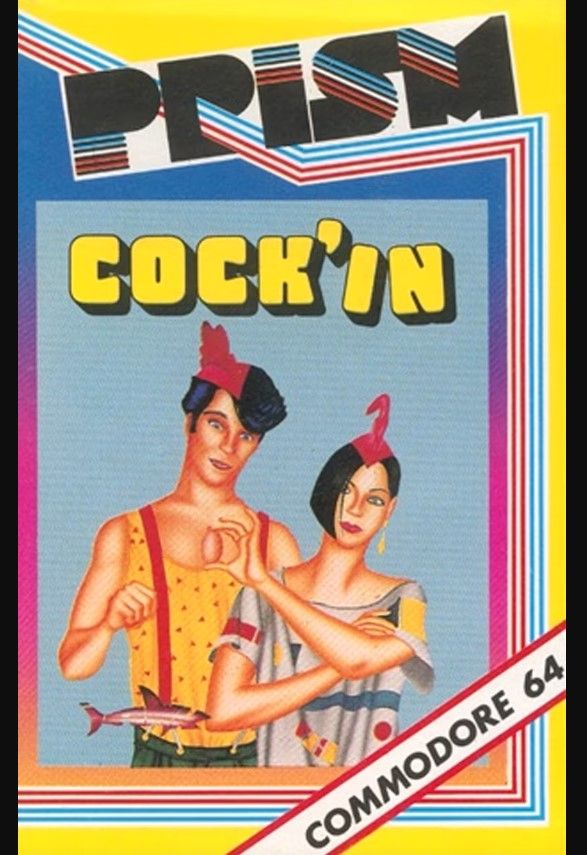
There are some games with box art that appear completely divorced from the actual game. Like Redditor Netsurfer_x2's choice for worst, "Cock'in for the C= 64. Yes, that was its real name. Brace yourself...I'm not kidding." The Redditor here is not exaggerating. The box art for Cock'In has nothing to do with anything.
With a name like that for a title, it was always going to be difficult to make appropriate box art, but the game involves running around as a chicken, so just a picture of the bird could have sufficed. Instead, it is an absurd portrait of two dead-eyed people with strange chicken-like hats and a random fish thrown in for good measure.
Ninja Scooter Simulator (Commodore 64, 1988)
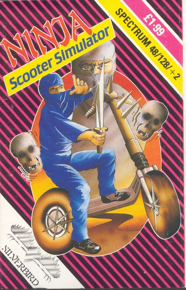
Reddit user HarlequinNight posts, "Ninja Scooter somehow manages to bend space and time with terrible scooter perspective drawing." Ninja Scooter Simulator may disappoint gamers expecting more when they hear the word "simulator" because Ninja Scooter is really just a side-scrolling racing game.
But if one were to assume the game from the box art only, they would expect some kind of sword fighting/horror game. The worst part is the dimensions of the scooter itself. How that design got through editors is hard to imagine, it barely looks like the artist even knew what a scooter was when they designed it.
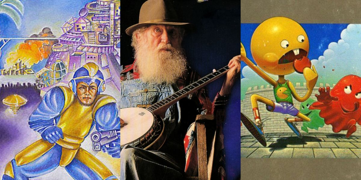
Pac-Man (Atari 400/800, 1982)
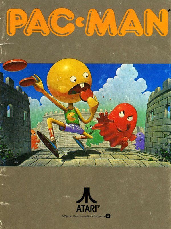
Reddit user sugarfoot_mghee writes about a classic game that had hideous box art upon re-release, "The box for the Atari 400/800 Pac-Man is pretty bad". The original Pac-Man design was so classic and recognizable, there was no need to change it for the update two years after the original release.
This Pac-Man box design is just awful, from the new alternate version of Pac-Man having a more humanoid design and weird track athlete outfit (with the superior logo on it) to the castle-like maze which has never been a theme of the series. It's a classic case of trying to fix something that's not broken.
Bomberman (TurboGrafx-16, 1990)
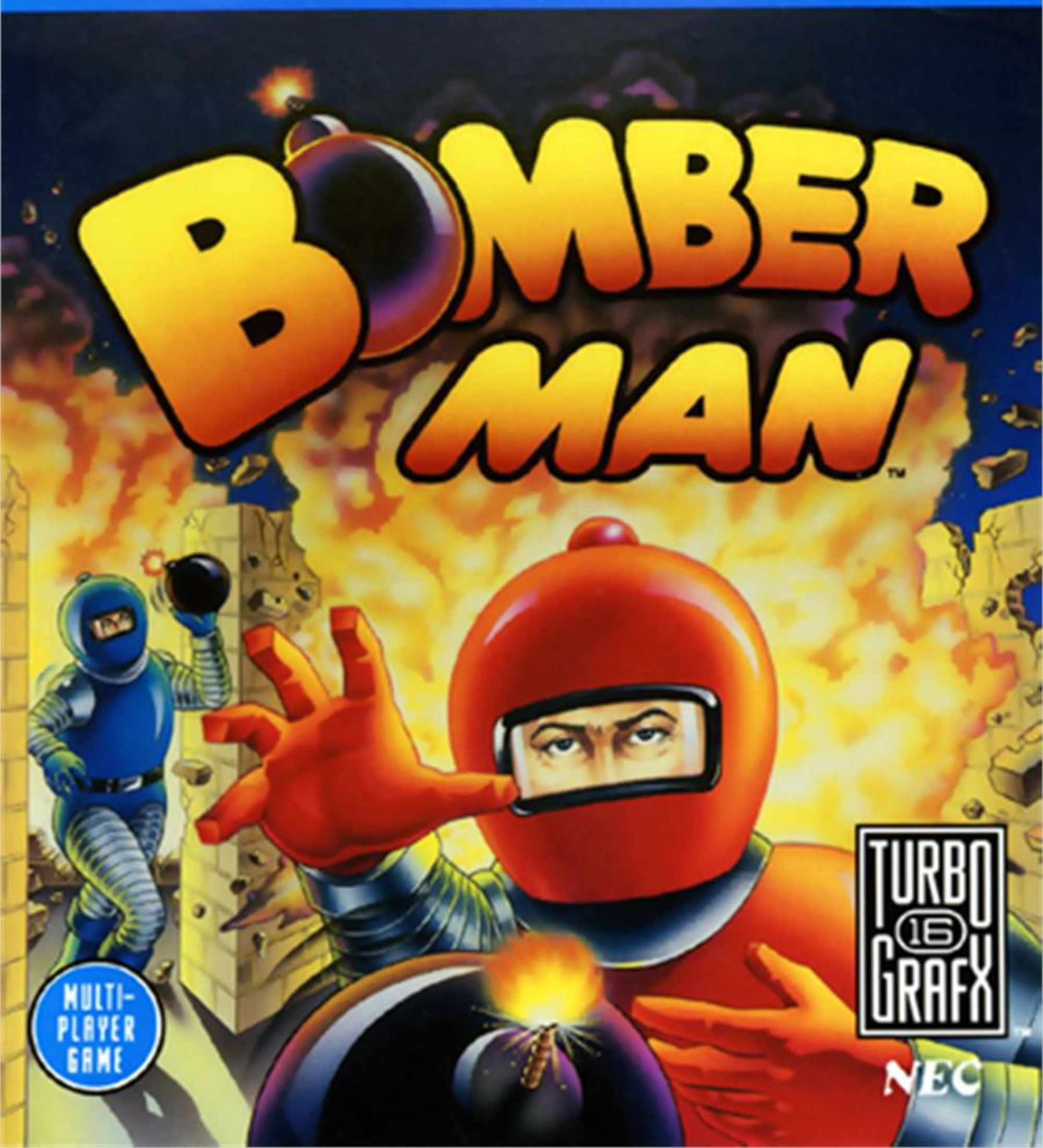
Bomberman is an arcade classic and a vintage series that still has resonance in the modern era of gaming. But one Reddit user vlei90 posts about the art for the TurboGrafx-16 console release of the game, "Bomberman for the Turbo Grafx. Easily my worst cover art."
Art for the short-lived TurboGrafx-16 gaming console was never the best but this Bomberman cover is particularly bad. It made the common misstep of including real, human-like features on the game cover. This was done to suggest higher quality graphics, but it ends up coming off as creepy. The goofy, spaceman suits their wearing look nothing like the characters in the game either.
Mega Man (NES, 1987)
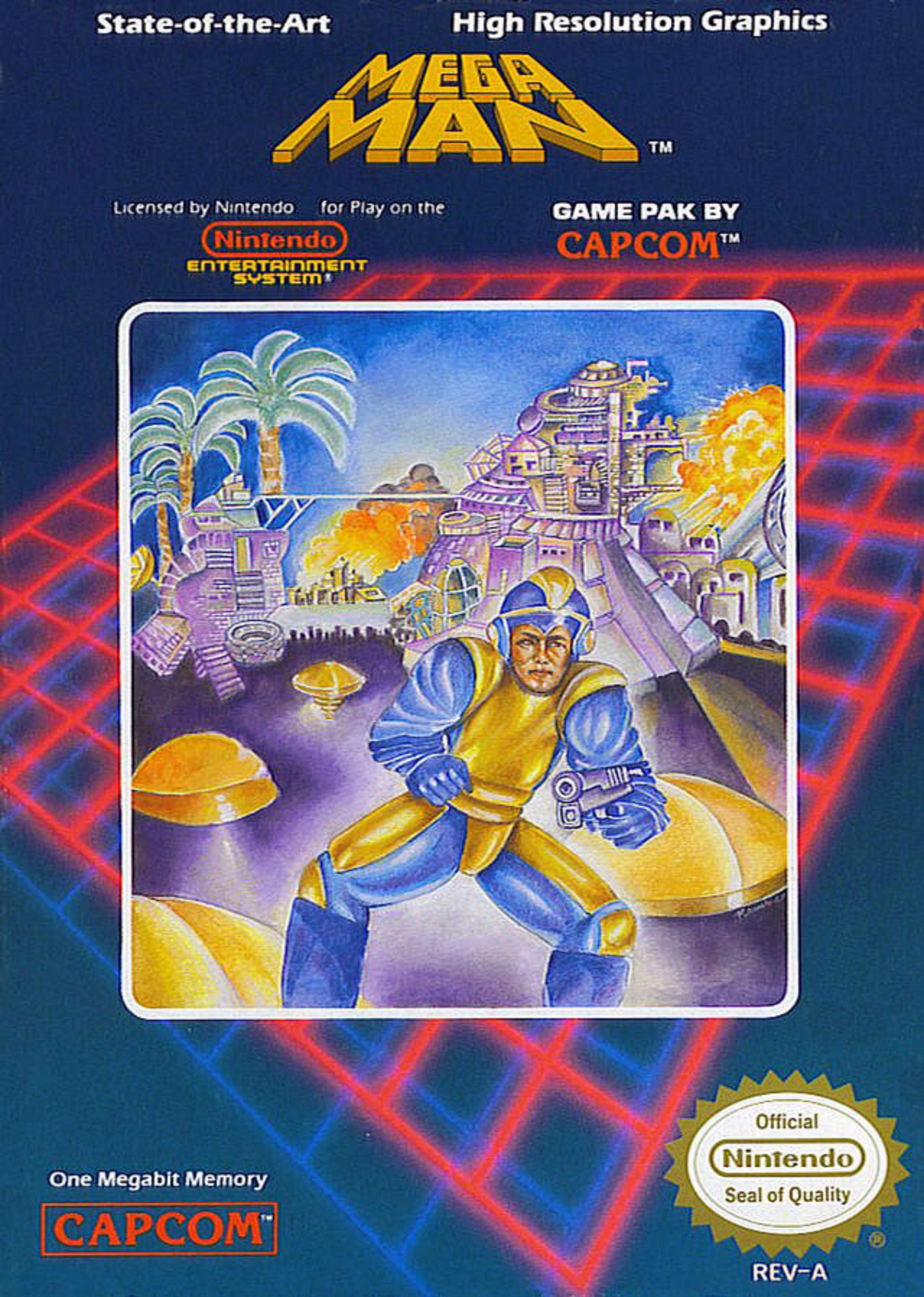
The paradigm of bad video game box art, the box art for the North American release of Capcom's Mega Man is legendarily bad, especially when compared to original Japanese art that was much more indicative of what the game art looked like. Redditor humaniteer recalls, "I have some very clear memories of me just holding that box in my hand in 1988, staring at it, and thinking, 'What the f---?'"
It looks like the artist had no clue what Mega Man was when asked to design the key art. It's one of the best robot video games of all time, yet the designer drew someone who looks like a grown man in a jumpsuit with a handgun rather than the character's iconic arm cannon. The result is baffling.
Phalanx (SNES, 1991)
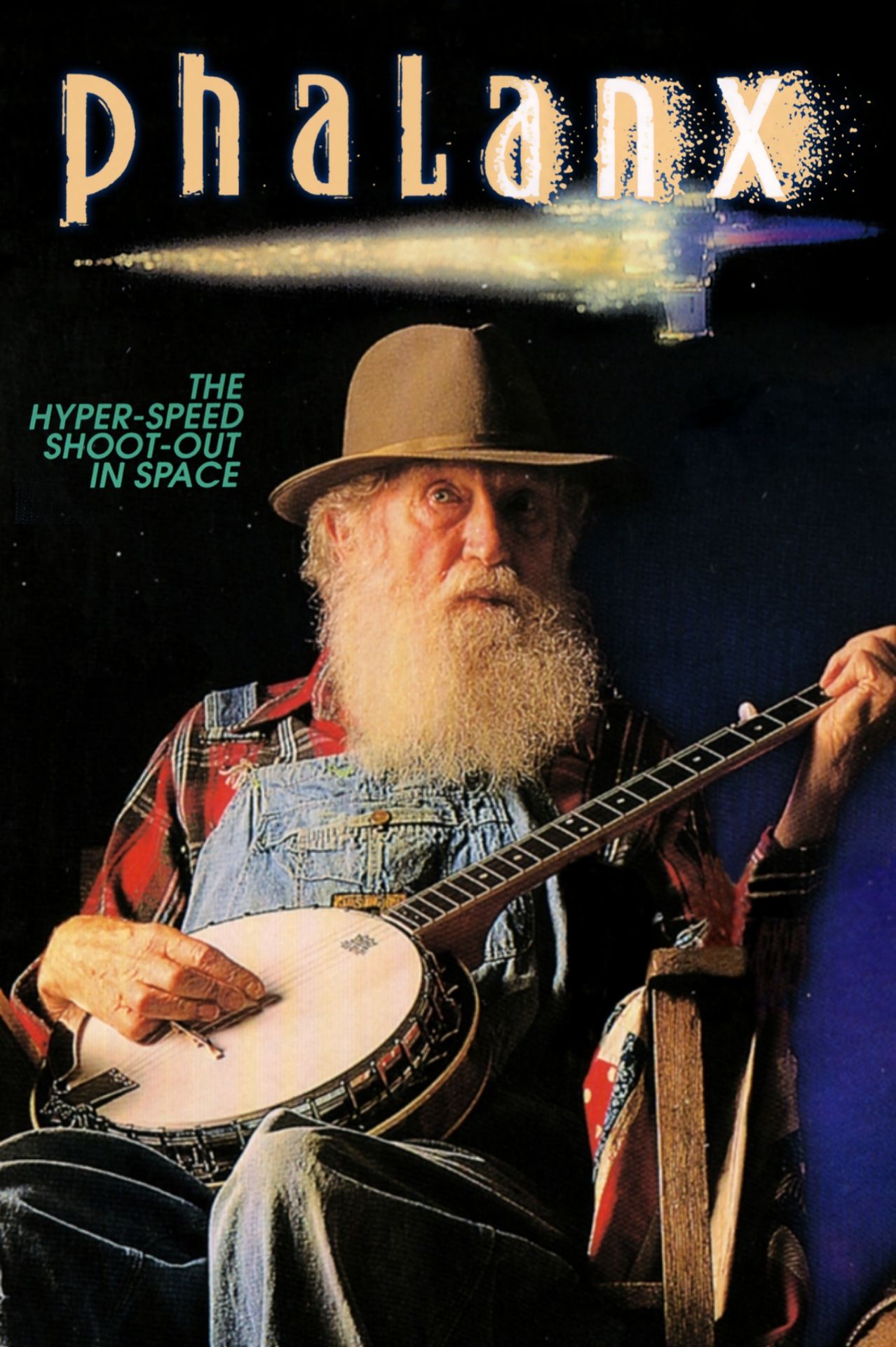
Reddit user Citrobacter notes that Phalanx for the SNES is "a space shooter, but features and old man holding a banjo on the box". Just as that Redditor says, Phalanx is indeed a space shooter by ZOOM Inc. that is basically the same as any other in the popular genre at the time. or some reason, but the designers decided to use a picture of an elderly gentleman playing the banjo as its box art. It may have been an attempt to set their game apart from the similar games of the time, but it just looks silly and borderline dumb looking back now and seeing all the creative art for other games.
Kong (Commodore 64, 1983)
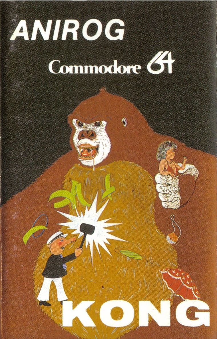
Redditor theWellRedMage writes, "One word: Anirog." In that comment chain, it's revealed that the game this Redditor is actually referring to is Kong by the developer Anirog, but one can't blame them for the mistake, seeing as "Anirog" appears as large as "Kong" does on the cover.
The game itself is a complete ripoff of Donkey Kong, and the box art seems to be trying to mimic Mario, DK and Pauline, but it's a much lesser version. The hyperrealistic, drooling ape-mouth, the bored damsel-in-distress, the man with a hammer and an extended nose, it's all wrong, and it's all hideous.
Source:gamerant.com